UX/UI Design
Polaris Dashboard
Polaris Dashboard is a sales and user analytics platform that gives businesses a real-time view of app and web performance — tracking sales trends, user growth, geographic distribution, and coupon usage across multiple channels.
Year :
2022
Industry :
SaaS / Business Intelligence
Client :
Polaris
Project Duration :
2 weeks

Problem :
Businesses selling across both app and web often struggle to get a unified view of performance — sales data, user demographics, and marketing metrics (like coupon usage) tend to live in separate reports, making it hard to spot trends or make fast, informed decisions during high-stakes periods like Black Friday or holiday campaigns.

Solution :
I designed a dark-themed dashboard that consolidates the most critical metrics into digestible visual modules: a channel-split sales summary (App vs. Web), a monthly sales trend area chart, a top-5 countries bar chart for geographic insight, user growth compared across key sales events, and a coupon usage line overlay against total sales — all using consistent color coding (pink/gold/blue) so users can track the same metric across different charts at a glance.

Challenge :
The main challenge was presenting dense, multi-dimensional data (time series, geographic rankings, gender split, event-based comparisons) on a single screen without creating visual fatigue. Choosing chart types that matched each data story — area charts for trends, horizontal bars for rankings, grouped bars for event comparison — was essential to keep the dashboard readable at a glance rather than requiring users to study each chart individually.
Summary :
Polaris Dashboard transforms scattered sales and user data into a single, scannable command center. By pairing a consistent color system with chart types tailored to each metric, the design lets business users spot trends, compare channels, and evaluate campaign performance quickly — without needing a data analyst to interpret it.

More Projects

UX/UI Design
Dating App
Typematch is a personality-driven dating app that helps users find matches based on compatibility beyond appearance — combining swipe-based discovery with detailed filtering by personality type, interests, and relationship intent.
UX/UI Design
Dating App
Typematch is a personality-driven dating app that helps users find matches based on compatibility beyond appearance — combining swipe-based discovery with detailed filtering by personality type, interests, and relationship intent.
UX/UI Design
Dating App
Typematch is a personality-driven dating app that helps users find matches based on compatibility beyond appearance — combining swipe-based discovery with detailed filtering by personality type, interests, and relationship intent.

UX/UI Design
Tirus e-Learning
Tirus is a mobile e-learning platform that connects users with courses across creative, technical, and professional fields — from motion design to programming and finance — through a personalized, content-first discovery experience.
UX/UI Design
Tirus e-Learning
Tirus is a mobile e-learning platform that connects users with courses across creative, technical, and professional fields — from motion design to programming and finance — through a personalized, content-first discovery experience.
UX/UI Design
Tirus e-Learning
Tirus is a mobile e-learning platform that connects users with courses across creative, technical, and professional fields — from motion design to programming and finance — through a personalized, content-first discovery experience.

UX/UI Design
One Tap Project
One Tap is a free-to-play competitive FPS where players battle as elite "agents" in intense 1v1 arena matches. The landing page introduces new players to the game's world through a bold, cinematic web experience that captures the tension and stakes of combat.
UX/UI Design
One Tap Project
One Tap is a free-to-play competitive FPS where players battle as elite "agents" in intense 1v1 arena matches. The landing page introduces new players to the game's world through a bold, cinematic web experience that captures the tension and stakes of combat.
UX/UI Design
One Tap Project
One Tap is a free-to-play competitive FPS where players battle as elite "agents" in intense 1v1 arena matches. The landing page introduces new players to the game's world through a bold, cinematic web experience that captures the tension and stakes of combat.

UX/UI Design
ASOS Redesign
A personal redesign exploration of ASOS.com, the UK-based online fashion and cosmetics retailer selling 850+ brands to young adults worldwide — reimagining the homepage to balance heavy promotional content with clearer product discovery.
UX/UI Design
ASOS Redesign
A personal redesign exploration of ASOS.com, the UK-based online fashion and cosmetics retailer selling 850+ brands to young adults worldwide — reimagining the homepage to balance heavy promotional content with clearer product discovery.
UX/UI Design
ASOS Redesign
A personal redesign exploration of ASOS.com, the UK-based online fashion and cosmetics retailer selling 850+ brands to young adults worldwide — reimagining the homepage to balance heavy promotional content with clearer product discovery.
UX/UI Design
UI Components V1
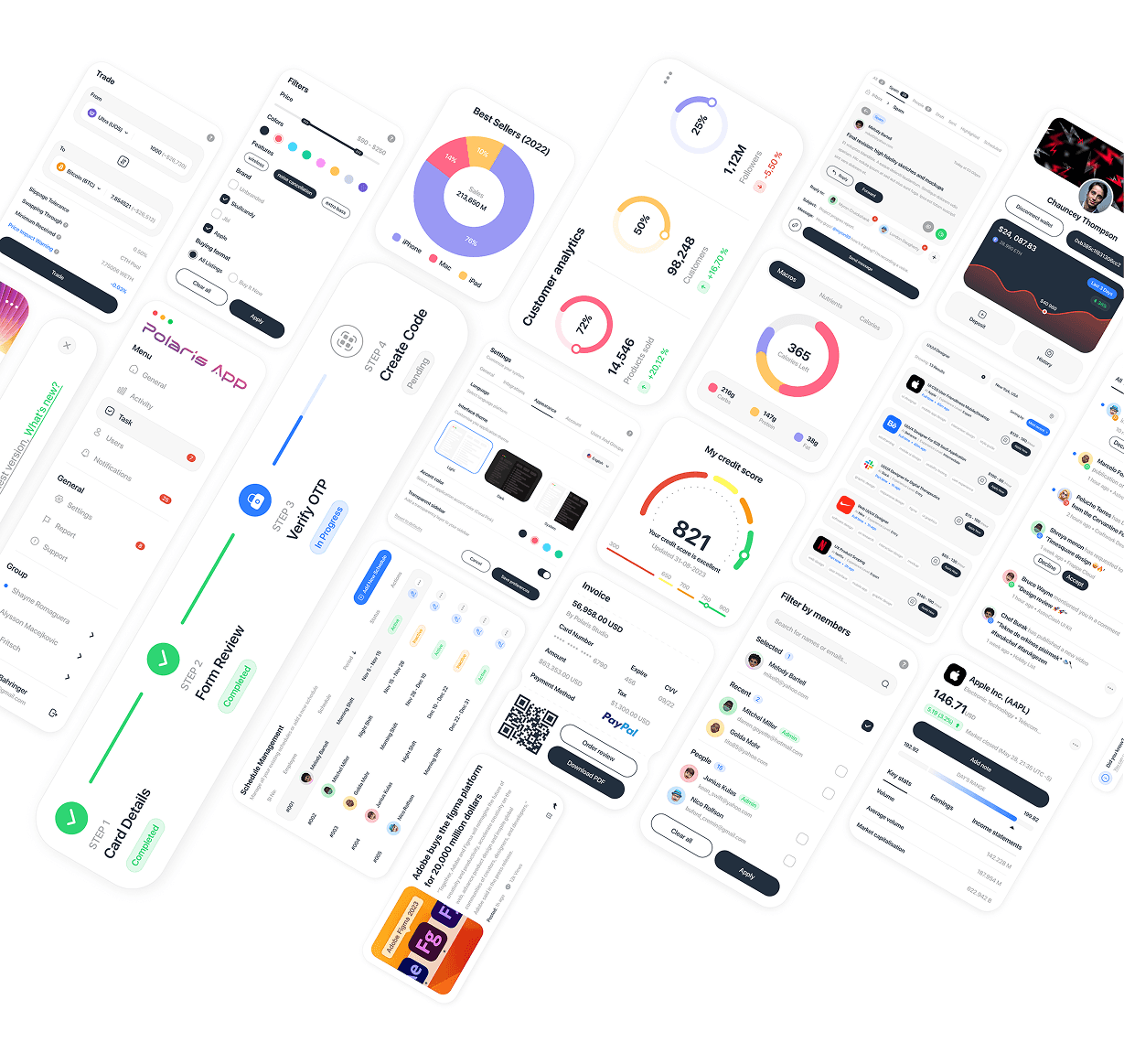
A curated collection of UI component explorations across fintech, analytics, admin, and communication interfaces — showcasing versatility in designing complex data visualizations, forms, and interactive elements across different product contexts.
UX/UI Design
UI Components V1
A curated collection of UI component explorations across fintech, analytics, admin, and communication interfaces — showcasing versatility in designing complex data visualizations, forms, and interactive elements across different product contexts.
UX/UI Design
UI Components V1
A curated collection of UI component explorations across fintech, analytics, admin, and communication interfaces — showcasing versatility in designing complex data visualizations, forms, and interactive elements across different product contexts.

UX/UI Design
Locomex Dashboard
Locomex is an AI-first supply chain sustainability platform for small and medium enterprises, offering project-based ESG scoring, supplier risk assessment, and diversity analytics — helping companies build resilient, compliant, and sustainable supply chains.
UX/UI Design
Locomex Dashboard
Locomex is an AI-first supply chain sustainability platform for small and medium enterprises, offering project-based ESG scoring, supplier risk assessment, and diversity analytics — helping companies build resilient, compliant, and sustainable supply chains.
UX/UI Design
Locomex Dashboard
Locomex is an AI-first supply chain sustainability platform for small and medium enterprises, offering project-based ESG scoring, supplier risk assessment, and diversity analytics — helping companies build resilient, compliant, and sustainable supply chains.
New release
Preview
UX/UI Design
Polaris Dashboard
Polaris Dashboard is a sales and user analytics platform that gives businesses a real-time view of app and web performance — tracking sales trends, user growth, geographic distribution, and coupon usage across multiple channels.
Year :
2022
Industry :
SaaS / Business Intelligence
Client :
Polaris
Project Duration :
2 weeks
Problem :
Businesses selling across both app and web often struggle to get a unified view of performance — sales data, user demographics, and marketing metrics (like coupon usage) tend to live in separate reports, making it hard to spot trends or make fast, informed decisions during high-stakes periods like Black Friday or holiday campaigns.
Solution :
I designed a dark-themed dashboard that consolidates the most critical metrics into digestible visual modules: a channel-split sales summary (App vs. Web), a monthly sales trend area chart, a top-5 countries bar chart for geographic insight, user growth compared across key sales events, and a coupon usage line overlay against total sales — all using consistent color coding (pink/gold/blue) so users can track the same metric across different charts at a glance.
Challenge :
The main challenge was presenting dense, multi-dimensional data (time series, geographic rankings, gender split, event-based comparisons) on a single screen without creating visual fatigue. Choosing chart types that matched each data story — area charts for trends, horizontal bars for rankings, grouped bars for event comparison — was essential to keep the dashboard readable at a glance rather than requiring users to study each chart individually.
Summary :
Polaris Dashboard transforms scattered sales and user data into a single, scannable command center. By pairing a consistent color system with chart types tailored to each metric, the design lets business users spot trends, compare channels, and evaluate campaign performance quickly — without needing a data analyst to interpret it.
More Projects
UX/UI Design
Dating App
Typematch is a personality-driven dating app that helps users find matches based on compatibility beyond appearance — combining swipe-based discovery with detailed filtering by personality type, interests, and relationship intent.
UX/UI Design
Dating App
Typematch is a personality-driven dating app that helps users find matches based on compatibility beyond appearance — combining swipe-based discovery with detailed filtering by personality type, interests, and relationship intent.
UX/UI Design
Dating App
Typematch is a personality-driven dating app that helps users find matches based on compatibility beyond appearance — combining swipe-based discovery with detailed filtering by personality type, interests, and relationship intent.
UX/UI Design
Tirus e-Learning
Tirus is a mobile e-learning platform that connects users with courses across creative, technical, and professional fields — from motion design to programming and finance — through a personalized, content-first discovery experience.
UX/UI Design
Tirus e-Learning
Tirus is a mobile e-learning platform that connects users with courses across creative, technical, and professional fields — from motion design to programming and finance — through a personalized, content-first discovery experience.
UX/UI Design
Tirus e-Learning
Tirus is a mobile e-learning platform that connects users with courses across creative, technical, and professional fields — from motion design to programming and finance — through a personalized, content-first discovery experience.
UX/UI Design
One Tap Project
One Tap is a free-to-play competitive FPS where players battle as elite "agents" in intense 1v1 arena matches. The landing page introduces new players to the game's world through a bold, cinematic web experience that captures the tension and stakes of combat.
UX/UI Design
One Tap Project
One Tap is a free-to-play competitive FPS where players battle as elite "agents" in intense 1v1 arena matches. The landing page introduces new players to the game's world through a bold, cinematic web experience that captures the tension and stakes of combat.
UX/UI Design
One Tap Project
One Tap is a free-to-play competitive FPS where players battle as elite "agents" in intense 1v1 arena matches. The landing page introduces new players to the game's world through a bold, cinematic web experience that captures the tension and stakes of combat.
UX/UI Design
ASOS Redesign
A personal redesign exploration of ASOS.com, the UK-based online fashion and cosmetics retailer selling 850+ brands to young adults worldwide — reimagining the homepage to balance heavy promotional content with clearer product discovery.
UX/UI Design
ASOS Redesign
A personal redesign exploration of ASOS.com, the UK-based online fashion and cosmetics retailer selling 850+ brands to young adults worldwide — reimagining the homepage to balance heavy promotional content with clearer product discovery.
UX/UI Design
ASOS Redesign
A personal redesign exploration of ASOS.com, the UK-based online fashion and cosmetics retailer selling 850+ brands to young adults worldwide — reimagining the homepage to balance heavy promotional content with clearer product discovery.
UX/UI Design
UI Components V1
A curated collection of UI component explorations across fintech, analytics, admin, and communication interfaces — showcasing versatility in designing complex data visualizations, forms, and interactive elements across different product contexts.
UX/UI Design
UI Components V1
A curated collection of UI component explorations across fintech, analytics, admin, and communication interfaces — showcasing versatility in designing complex data visualizations, forms, and interactive elements across different product contexts.
UX/UI Design
UI Components V1
A curated collection of UI component explorations across fintech, analytics, admin, and communication interfaces — showcasing versatility in designing complex data visualizations, forms, and interactive elements across different product contexts.
UX/UI Design
Locomex Dashboard
Locomex is an AI-first supply chain sustainability platform for small and medium enterprises, offering project-based ESG scoring, supplier risk assessment, and diversity analytics — helping companies build resilient, compliant, and sustainable supply chains.
UX/UI Design
Locomex Dashboard
Locomex is an AI-first supply chain sustainability platform for small and medium enterprises, offering project-based ESG scoring, supplier risk assessment, and diversity analytics — helping companies build resilient, compliant, and sustainable supply chains.
UX/UI Design
Locomex Dashboard
Locomex is an AI-first supply chain sustainability platform for small and medium enterprises, offering project-based ESG scoring, supplier risk assessment, and diversity analytics — helping companies build resilient, compliant, and sustainable supply chains.
New release
Preview
UX/UI Design
Polaris Dashboard
Polaris Dashboard is a sales and user analytics platform that gives businesses a real-time view of app and web performance — tracking sales trends, user growth, geographic distribution, and coupon usage across multiple channels.
Year :
2022
Industry :
SaaS / Business Intelligence
Client :
Polaris
Project Duration :
2 weeks
Problem :
Businesses selling across both app and web often struggle to get a unified view of performance — sales data, user demographics, and marketing metrics (like coupon usage) tend to live in separate reports, making it hard to spot trends or make fast, informed decisions during high-stakes periods like Black Friday or holiday campaigns.
Solution :
I designed a dark-themed dashboard that consolidates the most critical metrics into digestible visual modules: a channel-split sales summary (App vs. Web), a monthly sales trend area chart, a top-5 countries bar chart for geographic insight, user growth compared across key sales events, and a coupon usage line overlay against total sales — all using consistent color coding (pink/gold/blue) so users can track the same metric across different charts at a glance.
Challenge :
The main challenge was presenting dense, multi-dimensional data (time series, geographic rankings, gender split, event-based comparisons) on a single screen without creating visual fatigue. Choosing chart types that matched each data story — area charts for trends, horizontal bars for rankings, grouped bars for event comparison — was essential to keep the dashboard readable at a glance rather than requiring users to study each chart individually.
Summary :
Polaris Dashboard transforms scattered sales and user data into a single, scannable command center. By pairing a consistent color system with chart types tailored to each metric, the design lets business users spot trends, compare channels, and evaluate campaign performance quickly — without needing a data analyst to interpret it.
More Projects
UX/UI Design
Dating App
Typematch is a personality-driven dating app that helps users find matches based on compatibility beyond appearance — combining swipe-based discovery with detailed filtering by personality type, interests, and relationship intent.
UX/UI Design
Dating App
Typematch is a personality-driven dating app that helps users find matches based on compatibility beyond appearance — combining swipe-based discovery with detailed filtering by personality type, interests, and relationship intent.
UX/UI Design
Dating App
Typematch is a personality-driven dating app that helps users find matches based on compatibility beyond appearance — combining swipe-based discovery with detailed filtering by personality type, interests, and relationship intent.
UX/UI Design
Tirus e-Learning
Tirus is a mobile e-learning platform that connects users with courses across creative, technical, and professional fields — from motion design to programming and finance — through a personalized, content-first discovery experience.
UX/UI Design
Tirus e-Learning
Tirus is a mobile e-learning platform that connects users with courses across creative, technical, and professional fields — from motion design to programming and finance — through a personalized, content-first discovery experience.
UX/UI Design
Tirus e-Learning
Tirus is a mobile e-learning platform that connects users with courses across creative, technical, and professional fields — from motion design to programming and finance — through a personalized, content-first discovery experience.
UX/UI Design
One Tap Project
One Tap is a free-to-play competitive FPS where players battle as elite "agents" in intense 1v1 arena matches. The landing page introduces new players to the game's world through a bold, cinematic web experience that captures the tension and stakes of combat.
UX/UI Design
One Tap Project
One Tap is a free-to-play competitive FPS where players battle as elite "agents" in intense 1v1 arena matches. The landing page introduces new players to the game's world through a bold, cinematic web experience that captures the tension and stakes of combat.
UX/UI Design
One Tap Project
One Tap is a free-to-play competitive FPS where players battle as elite "agents" in intense 1v1 arena matches. The landing page introduces new players to the game's world through a bold, cinematic web experience that captures the tension and stakes of combat.
UX/UI Design
ASOS Redesign
A personal redesign exploration of ASOS.com, the UK-based online fashion and cosmetics retailer selling 850+ brands to young adults worldwide — reimagining the homepage to balance heavy promotional content with clearer product discovery.
UX/UI Design
ASOS Redesign
A personal redesign exploration of ASOS.com, the UK-based online fashion and cosmetics retailer selling 850+ brands to young adults worldwide — reimagining the homepage to balance heavy promotional content with clearer product discovery.
UX/UI Design
ASOS Redesign
A personal redesign exploration of ASOS.com, the UK-based online fashion and cosmetics retailer selling 850+ brands to young adults worldwide — reimagining the homepage to balance heavy promotional content with clearer product discovery.
UX/UI Design
UI Components V1
A curated collection of UI component explorations across fintech, analytics, admin, and communication interfaces — showcasing versatility in designing complex data visualizations, forms, and interactive elements across different product contexts.
UX/UI Design
UI Components V1
A curated collection of UI component explorations across fintech, analytics, admin, and communication interfaces — showcasing versatility in designing complex data visualizations, forms, and interactive elements across different product contexts.
UX/UI Design
UI Components V1
A curated collection of UI component explorations across fintech, analytics, admin, and communication interfaces — showcasing versatility in designing complex data visualizations, forms, and interactive elements across different product contexts.
UX/UI Design
Locomex Dashboard
Locomex is an AI-first supply chain sustainability platform for small and medium enterprises, offering project-based ESG scoring, supplier risk assessment, and diversity analytics — helping companies build resilient, compliant, and sustainable supply chains.
UX/UI Design
Locomex Dashboard
Locomex is an AI-first supply chain sustainability platform for small and medium enterprises, offering project-based ESG scoring, supplier risk assessment, and diversity analytics — helping companies build resilient, compliant, and sustainable supply chains.
UX/UI Design
Locomex Dashboard
Locomex is an AI-first supply chain sustainability platform for small and medium enterprises, offering project-based ESG scoring, supplier risk assessment, and diversity analytics — helping companies build resilient, compliant, and sustainable supply chains.
New release
Preview