UX/UI Design
ASOS Redesign
A personal redesign exploration of ASOS.com, the UK-based online fashion and cosmetics retailer selling 850+ brands to young adults worldwide — reimagining the homepage to balance heavy promotional content with clearer product discovery.
Year :
2023
Industry :
E-commerce
Client :
Personal Project
Project Duration :
3 weeks

Problem :
As a high-volume fashion retailer, ASOS's homepage carries constant pressure to promote sales, discounts, and seasonal campaigns — but this promotional density can easily overwhelm the actual shopping experience, burying category navigation and making it harder for users to move quickly from "browsing" to "buying."

Solution :
I restructured the homepage to create clearer visual breathing room between promotional banners and functional content: a strong hero promotion up top, followed by a scannable "Top Category" row with clean product photography, and a secondary discounts carousel further down for users still browsing deals. Clearance and sale messaging stays bold and on-brand (black-and-white contrast blocks) without competing directly with core navigation.

Challenge :
The biggest challenge was respecting ASOS's existing brand identity and aggressive promotional style — bold sale banners, high-contrast CTAs, dense product grids — while still improving scannability and hierarchy. Redesigning a well-known, high-traffic e-commerce site also meant working without direct access to real user data or business constraints, relying instead on UX heuristics and competitive e-commerce patterns.
Summary :
This personal project explores how a major fashion retailer can keep its aggressive promotional identity while improving product discoverability. The result is a homepage that still feels unmistakably ASOS — bold, sale-driven, fashion-forward — but with a clearer path from promotion to purchase.
More Projects

UX/UI Design
Dating App
Typematch is a personality-driven dating app that helps users find matches based on compatibility beyond appearance — combining swipe-based discovery with detailed filtering by personality type, interests, and relationship intent.
UX/UI Design
Dating App
Typematch is a personality-driven dating app that helps users find matches based on compatibility beyond appearance — combining swipe-based discovery with detailed filtering by personality type, interests, and relationship intent.
UX/UI Design
Dating App
Typematch is a personality-driven dating app that helps users find matches based on compatibility beyond appearance — combining swipe-based discovery with detailed filtering by personality type, interests, and relationship intent.

UX/UI Design
Tirus e-Learning
Tirus is a mobile e-learning platform that connects users with courses across creative, technical, and professional fields — from motion design to programming and finance — through a personalized, content-first discovery experience.
UX/UI Design
Tirus e-Learning
Tirus is a mobile e-learning platform that connects users with courses across creative, technical, and professional fields — from motion design to programming and finance — through a personalized, content-first discovery experience.
UX/UI Design
Tirus e-Learning
Tirus is a mobile e-learning platform that connects users with courses across creative, technical, and professional fields — from motion design to programming and finance — through a personalized, content-first discovery experience.

UX/UI Design
One Tap Project
One Tap is a free-to-play competitive FPS where players battle as elite "agents" in intense 1v1 arena matches. The landing page introduces new players to the game's world through a bold, cinematic web experience that captures the tension and stakes of combat.
UX/UI Design
One Tap Project
One Tap is a free-to-play competitive FPS where players battle as elite "agents" in intense 1v1 arena matches. The landing page introduces new players to the game's world through a bold, cinematic web experience that captures the tension and stakes of combat.
UX/UI Design
One Tap Project
One Tap is a free-to-play competitive FPS where players battle as elite "agents" in intense 1v1 arena matches. The landing page introduces new players to the game's world through a bold, cinematic web experience that captures the tension and stakes of combat.
UX/UI Design
UI Components V1
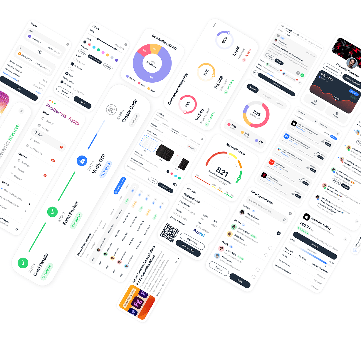
A curated collection of UI component explorations across fintech, analytics, admin, and communication interfaces — showcasing versatility in designing complex data visualizations, forms, and interactive elements across different product contexts.
UX/UI Design
UI Components V1
A curated collection of UI component explorations across fintech, analytics, admin, and communication interfaces — showcasing versatility in designing complex data visualizations, forms, and interactive elements across different product contexts.
UX/UI Design
UI Components V1
A curated collection of UI component explorations across fintech, analytics, admin, and communication interfaces — showcasing versatility in designing complex data visualizations, forms, and interactive elements across different product contexts.

UX/UI Design
Polaris Dashboard
Polaris Dashboard is a sales and user analytics platform that gives businesses a real-time view of app and web performance — tracking sales trends, user growth, geographic distribution, and coupon usage across multiple channels.
UX/UI Design
Polaris Dashboard
Polaris Dashboard is a sales and user analytics platform that gives businesses a real-time view of app and web performance — tracking sales trends, user growth, geographic distribution, and coupon usage across multiple channels.
UX/UI Design
Polaris Dashboard
Polaris Dashboard is a sales and user analytics platform that gives businesses a real-time view of app and web performance — tracking sales trends, user growth, geographic distribution, and coupon usage across multiple channels.

UX/UI Design
Locomex Dashboard
Locomex is an AI-first supply chain sustainability platform for small and medium enterprises, offering project-based ESG scoring, supplier risk assessment, and diversity analytics — helping companies build resilient, compliant, and sustainable supply chains.
UX/UI Design
Locomex Dashboard
Locomex is an AI-first supply chain sustainability platform for small and medium enterprises, offering project-based ESG scoring, supplier risk assessment, and diversity analytics — helping companies build resilient, compliant, and sustainable supply chains.
UX/UI Design
Locomex Dashboard
Locomex is an AI-first supply chain sustainability platform for small and medium enterprises, offering project-based ESG scoring, supplier risk assessment, and diversity analytics — helping companies build resilient, compliant, and sustainable supply chains.
New release
Preview
UX/UI Design
ASOS Redesign
A personal redesign exploration of ASOS.com, the UK-based online fashion and cosmetics retailer selling 850+ brands to young adults worldwide — reimagining the homepage to balance heavy promotional content with clearer product discovery.
Year :
2023
Industry :
E-commerce
Client :
Personal Project
Project Duration :
3 weeks
Problem :
As a high-volume fashion retailer, ASOS's homepage carries constant pressure to promote sales, discounts, and seasonal campaigns — but this promotional density can easily overwhelm the actual shopping experience, burying category navigation and making it harder for users to move quickly from "browsing" to "buying."
Solution :
I restructured the homepage to create clearer visual breathing room between promotional banners and functional content: a strong hero promotion up top, followed by a scannable "Top Category" row with clean product photography, and a secondary discounts carousel further down for users still browsing deals. Clearance and sale messaging stays bold and on-brand (black-and-white contrast blocks) without competing directly with core navigation.
Challenge :
The biggest challenge was respecting ASOS's existing brand identity and aggressive promotional style — bold sale banners, high-contrast CTAs, dense product grids — while still improving scannability and hierarchy. Redesigning a well-known, high-traffic e-commerce site also meant working without direct access to real user data or business constraints, relying instead on UX heuristics and competitive e-commerce patterns.
Summary :
This personal project explores how a major fashion retailer can keep its aggressive promotional identity while improving product discoverability. The result is a homepage that still feels unmistakably ASOS — bold, sale-driven, fashion-forward — but with a clearer path from promotion to purchase.
More Projects
UX/UI Design
Dating App
Typematch is a personality-driven dating app that helps users find matches based on compatibility beyond appearance — combining swipe-based discovery with detailed filtering by personality type, interests, and relationship intent.
UX/UI Design
Dating App
Typematch is a personality-driven dating app that helps users find matches based on compatibility beyond appearance — combining swipe-based discovery with detailed filtering by personality type, interests, and relationship intent.
UX/UI Design
Dating App
Typematch is a personality-driven dating app that helps users find matches based on compatibility beyond appearance — combining swipe-based discovery with detailed filtering by personality type, interests, and relationship intent.
UX/UI Design
Tirus e-Learning
Tirus is a mobile e-learning platform that connects users with courses across creative, technical, and professional fields — from motion design to programming and finance — through a personalized, content-first discovery experience.
UX/UI Design
Tirus e-Learning
Tirus is a mobile e-learning platform that connects users with courses across creative, technical, and professional fields — from motion design to programming and finance — through a personalized, content-first discovery experience.
UX/UI Design
Tirus e-Learning
Tirus is a mobile e-learning platform that connects users with courses across creative, technical, and professional fields — from motion design to programming and finance — through a personalized, content-first discovery experience.
UX/UI Design
One Tap Project
One Tap is a free-to-play competitive FPS where players battle as elite "agents" in intense 1v1 arena matches. The landing page introduces new players to the game's world through a bold, cinematic web experience that captures the tension and stakes of combat.
UX/UI Design
One Tap Project
One Tap is a free-to-play competitive FPS where players battle as elite "agents" in intense 1v1 arena matches. The landing page introduces new players to the game's world through a bold, cinematic web experience that captures the tension and stakes of combat.
UX/UI Design
One Tap Project
One Tap is a free-to-play competitive FPS where players battle as elite "agents" in intense 1v1 arena matches. The landing page introduces new players to the game's world through a bold, cinematic web experience that captures the tension and stakes of combat.
UX/UI Design
UI Components V1
A curated collection of UI component explorations across fintech, analytics, admin, and communication interfaces — showcasing versatility in designing complex data visualizations, forms, and interactive elements across different product contexts.
UX/UI Design
UI Components V1
A curated collection of UI component explorations across fintech, analytics, admin, and communication interfaces — showcasing versatility in designing complex data visualizations, forms, and interactive elements across different product contexts.
UX/UI Design
UI Components V1
A curated collection of UI component explorations across fintech, analytics, admin, and communication interfaces — showcasing versatility in designing complex data visualizations, forms, and interactive elements across different product contexts.
UX/UI Design
Polaris Dashboard
Polaris Dashboard is a sales and user analytics platform that gives businesses a real-time view of app and web performance — tracking sales trends, user growth, geographic distribution, and coupon usage across multiple channels.
UX/UI Design
Polaris Dashboard
Polaris Dashboard is a sales and user analytics platform that gives businesses a real-time view of app and web performance — tracking sales trends, user growth, geographic distribution, and coupon usage across multiple channels.
UX/UI Design
Polaris Dashboard
Polaris Dashboard is a sales and user analytics platform that gives businesses a real-time view of app and web performance — tracking sales trends, user growth, geographic distribution, and coupon usage across multiple channels.
UX/UI Design
Locomex Dashboard
Locomex is an AI-first supply chain sustainability platform for small and medium enterprises, offering project-based ESG scoring, supplier risk assessment, and diversity analytics — helping companies build resilient, compliant, and sustainable supply chains.
UX/UI Design
Locomex Dashboard
Locomex is an AI-first supply chain sustainability platform for small and medium enterprises, offering project-based ESG scoring, supplier risk assessment, and diversity analytics — helping companies build resilient, compliant, and sustainable supply chains.
UX/UI Design
Locomex Dashboard
Locomex is an AI-first supply chain sustainability platform for small and medium enterprises, offering project-based ESG scoring, supplier risk assessment, and diversity analytics — helping companies build resilient, compliant, and sustainable supply chains.
New release
Preview
UX/UI Design
ASOS Redesign
A personal redesign exploration of ASOS.com, the UK-based online fashion and cosmetics retailer selling 850+ brands to young adults worldwide — reimagining the homepage to balance heavy promotional content with clearer product discovery.
Year :
2023
Industry :
E-commerce
Client :
Personal Project
Project Duration :
3 weeks
Problem :
As a high-volume fashion retailer, ASOS's homepage carries constant pressure to promote sales, discounts, and seasonal campaigns — but this promotional density can easily overwhelm the actual shopping experience, burying category navigation and making it harder for users to move quickly from "browsing" to "buying."
Solution :
I restructured the homepage to create clearer visual breathing room between promotional banners and functional content: a strong hero promotion up top, followed by a scannable "Top Category" row with clean product photography, and a secondary discounts carousel further down for users still browsing deals. Clearance and sale messaging stays bold and on-brand (black-and-white contrast blocks) without competing directly with core navigation.
Challenge :
The biggest challenge was respecting ASOS's existing brand identity and aggressive promotional style — bold sale banners, high-contrast CTAs, dense product grids — while still improving scannability and hierarchy. Redesigning a well-known, high-traffic e-commerce site also meant working without direct access to real user data or business constraints, relying instead on UX heuristics and competitive e-commerce patterns.
Summary :
This personal project explores how a major fashion retailer can keep its aggressive promotional identity while improving product discoverability. The result is a homepage that still feels unmistakably ASOS — bold, sale-driven, fashion-forward — but with a clearer path from promotion to purchase.
More Projects
UX/UI Design
Dating App
Typematch is a personality-driven dating app that helps users find matches based on compatibility beyond appearance — combining swipe-based discovery with detailed filtering by personality type, interests, and relationship intent.
UX/UI Design
Dating App
Typematch is a personality-driven dating app that helps users find matches based on compatibility beyond appearance — combining swipe-based discovery with detailed filtering by personality type, interests, and relationship intent.
UX/UI Design
Dating App
Typematch is a personality-driven dating app that helps users find matches based on compatibility beyond appearance — combining swipe-based discovery with detailed filtering by personality type, interests, and relationship intent.
UX/UI Design
Tirus e-Learning
Tirus is a mobile e-learning platform that connects users with courses across creative, technical, and professional fields — from motion design to programming and finance — through a personalized, content-first discovery experience.
UX/UI Design
Tirus e-Learning
Tirus is a mobile e-learning platform that connects users with courses across creative, technical, and professional fields — from motion design to programming and finance — through a personalized, content-first discovery experience.
UX/UI Design
Tirus e-Learning
Tirus is a mobile e-learning platform that connects users with courses across creative, technical, and professional fields — from motion design to programming and finance — through a personalized, content-first discovery experience.
UX/UI Design
One Tap Project
One Tap is a free-to-play competitive FPS where players battle as elite "agents" in intense 1v1 arena matches. The landing page introduces new players to the game's world through a bold, cinematic web experience that captures the tension and stakes of combat.
UX/UI Design
One Tap Project
One Tap is a free-to-play competitive FPS where players battle as elite "agents" in intense 1v1 arena matches. The landing page introduces new players to the game's world through a bold, cinematic web experience that captures the tension and stakes of combat.
UX/UI Design
One Tap Project
One Tap is a free-to-play competitive FPS where players battle as elite "agents" in intense 1v1 arena matches. The landing page introduces new players to the game's world through a bold, cinematic web experience that captures the tension and stakes of combat.
UX/UI Design
UI Components V1
A curated collection of UI component explorations across fintech, analytics, admin, and communication interfaces — showcasing versatility in designing complex data visualizations, forms, and interactive elements across different product contexts.
UX/UI Design
UI Components V1
A curated collection of UI component explorations across fintech, analytics, admin, and communication interfaces — showcasing versatility in designing complex data visualizations, forms, and interactive elements across different product contexts.
UX/UI Design
UI Components V1
A curated collection of UI component explorations across fintech, analytics, admin, and communication interfaces — showcasing versatility in designing complex data visualizations, forms, and interactive elements across different product contexts.
UX/UI Design
Polaris Dashboard
Polaris Dashboard is a sales and user analytics platform that gives businesses a real-time view of app and web performance — tracking sales trends, user growth, geographic distribution, and coupon usage across multiple channels.
UX/UI Design
Polaris Dashboard
Polaris Dashboard is a sales and user analytics platform that gives businesses a real-time view of app and web performance — tracking sales trends, user growth, geographic distribution, and coupon usage across multiple channels.
UX/UI Design
Polaris Dashboard
Polaris Dashboard is a sales and user analytics platform that gives businesses a real-time view of app and web performance — tracking sales trends, user growth, geographic distribution, and coupon usage across multiple channels.
UX/UI Design
Locomex Dashboard
Locomex is an AI-first supply chain sustainability platform for small and medium enterprises, offering project-based ESG scoring, supplier risk assessment, and diversity analytics — helping companies build resilient, compliant, and sustainable supply chains.
UX/UI Design
Locomex Dashboard
Locomex is an AI-first supply chain sustainability platform for small and medium enterprises, offering project-based ESG scoring, supplier risk assessment, and diversity analytics — helping companies build resilient, compliant, and sustainable supply chains.
UX/UI Design
Locomex Dashboard
Locomex is an AI-first supply chain sustainability platform for small and medium enterprises, offering project-based ESG scoring, supplier risk assessment, and diversity analytics — helping companies build resilient, compliant, and sustainable supply chains.
New release
Preview