UX/UI Design
One Tap Project
One Tap is a free-to-play competitive FPS where players battle as elite "agents" in intense 1v1 arena matches. The landing page introduces new players to the game's world through a bold, cinematic web experience that captures the tension and stakes of combat.
Year :
2023
Industry :
Gaming / Entertainment
Client :
Qor Gaming
Project Duration :
7 weeks

Problem :
Competitive FPS games live or die by their first impression — players decide whether to download within seconds of landing on the site. One Tap needed a web presence that communicated the intensity and skill-based nature of the game (not just "another shooter"), while clearly guiding new visitors toward key actions: playing now, watching the trailer, or exploring game modes, weapons, and pets.

Solution :
I designed a hero section built around cinematic character art and high-contrast typography ("READY FOR THE BATTLE") to immediately establish tone and stakes. A vertical icon rail on the left previews core game pillars (game modes, pets, weapons) without cluttering the hero, while dual CTAs — "Play Now" and "Watch Trailer" — cater to both ready-to-play users and those needing more context first. The dark, textured background and gradient accent on the primary CTA reinforce the game's aggressive, high-stakes identity.


Challenge :
The main challenge was balancing visual intensity with usability: gaming audiences expect bold, dramatic art direction, but that same drama can easily bury navigation and calls-to-action. Fitting rich game lore (multiple weapon types, four pet categories, arena mechanics) into a scannable homepage — without turning it into a wall of text — required tight prioritization of what appears above the fold versus deeper in the page.
Summary :
The One Tap landing page translates the game's competitive, high-stakes identity into a web experience that feels as cinematic as the game itself. By leading with striking visuals and clear, dual-path CTAs, the design converts curiosity into action while leaving room to explore the game's deeper systems — weapons, pets, and arena mode — for players who want more before diving in.

More Projects

UX/UI Design
Dating App
Typematch is a personality-driven dating app that helps users find matches based on compatibility beyond appearance — combining swipe-based discovery with detailed filtering by personality type, interests, and relationship intent.
UX/UI Design
Dating App
Typematch is a personality-driven dating app that helps users find matches based on compatibility beyond appearance — combining swipe-based discovery with detailed filtering by personality type, interests, and relationship intent.
UX/UI Design
Dating App
Typematch is a personality-driven dating app that helps users find matches based on compatibility beyond appearance — combining swipe-based discovery with detailed filtering by personality type, interests, and relationship intent.

UX/UI Design
Tirus e-Learning
Tirus is a mobile e-learning platform that connects users with courses across creative, technical, and professional fields — from motion design to programming and finance — through a personalized, content-first discovery experience.
UX/UI Design
Tirus e-Learning
Tirus is a mobile e-learning platform that connects users with courses across creative, technical, and professional fields — from motion design to programming and finance — through a personalized, content-first discovery experience.
UX/UI Design
Tirus e-Learning
Tirus is a mobile e-learning platform that connects users with courses across creative, technical, and professional fields — from motion design to programming and finance — through a personalized, content-first discovery experience.

UX/UI Design
ASOS Redesign
A personal redesign exploration of ASOS.com, the UK-based online fashion and cosmetics retailer selling 850+ brands to young adults worldwide — reimagining the homepage to balance heavy promotional content with clearer product discovery.
UX/UI Design
ASOS Redesign
A personal redesign exploration of ASOS.com, the UK-based online fashion and cosmetics retailer selling 850+ brands to young adults worldwide — reimagining the homepage to balance heavy promotional content with clearer product discovery.
UX/UI Design
ASOS Redesign
A personal redesign exploration of ASOS.com, the UK-based online fashion and cosmetics retailer selling 850+ brands to young adults worldwide — reimagining the homepage to balance heavy promotional content with clearer product discovery.
UX/UI Design
UI Components V1
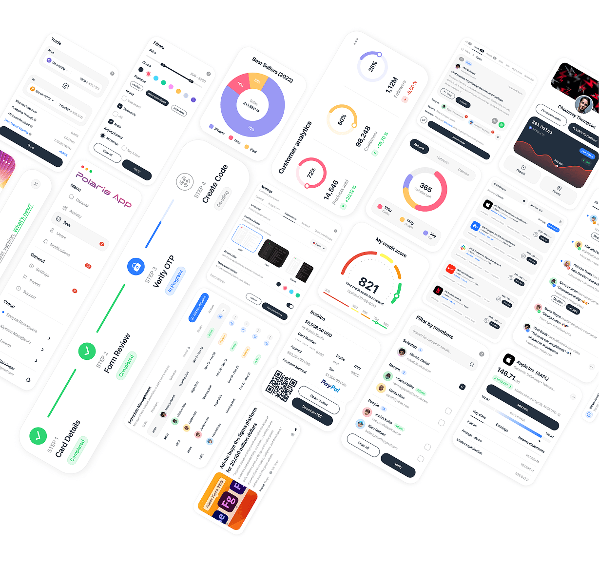
A curated collection of UI component explorations across fintech, analytics, admin, and communication interfaces — showcasing versatility in designing complex data visualizations, forms, and interactive elements across different product contexts.
UX/UI Design
UI Components V1
A curated collection of UI component explorations across fintech, analytics, admin, and communication interfaces — showcasing versatility in designing complex data visualizations, forms, and interactive elements across different product contexts.
UX/UI Design
UI Components V1
A curated collection of UI component explorations across fintech, analytics, admin, and communication interfaces — showcasing versatility in designing complex data visualizations, forms, and interactive elements across different product contexts.

UX/UI Design
Polaris Dashboard
Polaris Dashboard is a sales and user analytics platform that gives businesses a real-time view of app and web performance — tracking sales trends, user growth, geographic distribution, and coupon usage across multiple channels.
UX/UI Design
Polaris Dashboard
Polaris Dashboard is a sales and user analytics platform that gives businesses a real-time view of app and web performance — tracking sales trends, user growth, geographic distribution, and coupon usage across multiple channels.
UX/UI Design
Polaris Dashboard
Polaris Dashboard is a sales and user analytics platform that gives businesses a real-time view of app and web performance — tracking sales trends, user growth, geographic distribution, and coupon usage across multiple channels.

UX/UI Design
Locomex Dashboard
Locomex is an AI-first supply chain sustainability platform for small and medium enterprises, offering project-based ESG scoring, supplier risk assessment, and diversity analytics — helping companies build resilient, compliant, and sustainable supply chains.
UX/UI Design
Locomex Dashboard
Locomex is an AI-first supply chain sustainability platform for small and medium enterprises, offering project-based ESG scoring, supplier risk assessment, and diversity analytics — helping companies build resilient, compliant, and sustainable supply chains.
UX/UI Design
Locomex Dashboard
Locomex is an AI-first supply chain sustainability platform for small and medium enterprises, offering project-based ESG scoring, supplier risk assessment, and diversity analytics — helping companies build resilient, compliant, and sustainable supply chains.
New release
Preview
UX/UI Design
One Tap Project
One Tap is a free-to-play competitive FPS where players battle as elite "agents" in intense 1v1 arena matches. The landing page introduces new players to the game's world through a bold, cinematic web experience that captures the tension and stakes of combat.
Year :
2023
Industry :
Gaming / Entertainment
Client :
Qor Gaming
Project Duration :
7 weeks
Problem :
Competitive FPS games live or die by their first impression — players decide whether to download within seconds of landing on the site. One Tap needed a web presence that communicated the intensity and skill-based nature of the game (not just "another shooter"), while clearly guiding new visitors toward key actions: playing now, watching the trailer, or exploring game modes, weapons, and pets.
Solution :
I designed a hero section built around cinematic character art and high-contrast typography ("READY FOR THE BATTLE") to immediately establish tone and stakes. A vertical icon rail on the left previews core game pillars (game modes, pets, weapons) without cluttering the hero, while dual CTAs — "Play Now" and "Watch Trailer" — cater to both ready-to-play users and those needing more context first. The dark, textured background and gradient accent on the primary CTA reinforce the game's aggressive, high-stakes identity.
Challenge :
The main challenge was balancing visual intensity with usability: gaming audiences expect bold, dramatic art direction, but that same drama can easily bury navigation and calls-to-action. Fitting rich game lore (multiple weapon types, four pet categories, arena mechanics) into a scannable homepage — without turning it into a wall of text — required tight prioritization of what appears above the fold versus deeper in the page.
Summary :
The One Tap landing page translates the game's competitive, high-stakes identity into a web experience that feels as cinematic as the game itself. By leading with striking visuals and clear, dual-path CTAs, the design converts curiosity into action while leaving room to explore the game's deeper systems — weapons, pets, and arena mode — for players who want more before diving in.
More Projects
UX/UI Design
Dating App
Typematch is a personality-driven dating app that helps users find matches based on compatibility beyond appearance — combining swipe-based discovery with detailed filtering by personality type, interests, and relationship intent.
UX/UI Design
Dating App
Typematch is a personality-driven dating app that helps users find matches based on compatibility beyond appearance — combining swipe-based discovery with detailed filtering by personality type, interests, and relationship intent.
UX/UI Design
Dating App
Typematch is a personality-driven dating app that helps users find matches based on compatibility beyond appearance — combining swipe-based discovery with detailed filtering by personality type, interests, and relationship intent.
UX/UI Design
Tirus e-Learning
Tirus is a mobile e-learning platform that connects users with courses across creative, technical, and professional fields — from motion design to programming and finance — through a personalized, content-first discovery experience.
UX/UI Design
Tirus e-Learning
Tirus is a mobile e-learning platform that connects users with courses across creative, technical, and professional fields — from motion design to programming and finance — through a personalized, content-first discovery experience.
UX/UI Design
Tirus e-Learning
Tirus is a mobile e-learning platform that connects users with courses across creative, technical, and professional fields — from motion design to programming and finance — through a personalized, content-first discovery experience.
UX/UI Design
ASOS Redesign
A personal redesign exploration of ASOS.com, the UK-based online fashion and cosmetics retailer selling 850+ brands to young adults worldwide — reimagining the homepage to balance heavy promotional content with clearer product discovery.
UX/UI Design
ASOS Redesign
A personal redesign exploration of ASOS.com, the UK-based online fashion and cosmetics retailer selling 850+ brands to young adults worldwide — reimagining the homepage to balance heavy promotional content with clearer product discovery.
UX/UI Design
ASOS Redesign
A personal redesign exploration of ASOS.com, the UK-based online fashion and cosmetics retailer selling 850+ brands to young adults worldwide — reimagining the homepage to balance heavy promotional content with clearer product discovery.
UX/UI Design
UI Components V1
A curated collection of UI component explorations across fintech, analytics, admin, and communication interfaces — showcasing versatility in designing complex data visualizations, forms, and interactive elements across different product contexts.
UX/UI Design
UI Components V1
A curated collection of UI component explorations across fintech, analytics, admin, and communication interfaces — showcasing versatility in designing complex data visualizations, forms, and interactive elements across different product contexts.
UX/UI Design
UI Components V1
A curated collection of UI component explorations across fintech, analytics, admin, and communication interfaces — showcasing versatility in designing complex data visualizations, forms, and interactive elements across different product contexts.
UX/UI Design
Polaris Dashboard
Polaris Dashboard is a sales and user analytics platform that gives businesses a real-time view of app and web performance — tracking sales trends, user growth, geographic distribution, and coupon usage across multiple channels.
UX/UI Design
Polaris Dashboard
Polaris Dashboard is a sales and user analytics platform that gives businesses a real-time view of app and web performance — tracking sales trends, user growth, geographic distribution, and coupon usage across multiple channels.
UX/UI Design
Polaris Dashboard
Polaris Dashboard is a sales and user analytics platform that gives businesses a real-time view of app and web performance — tracking sales trends, user growth, geographic distribution, and coupon usage across multiple channels.
UX/UI Design
Locomex Dashboard
Locomex is an AI-first supply chain sustainability platform for small and medium enterprises, offering project-based ESG scoring, supplier risk assessment, and diversity analytics — helping companies build resilient, compliant, and sustainable supply chains.
UX/UI Design
Locomex Dashboard
Locomex is an AI-first supply chain sustainability platform for small and medium enterprises, offering project-based ESG scoring, supplier risk assessment, and diversity analytics — helping companies build resilient, compliant, and sustainable supply chains.
UX/UI Design
Locomex Dashboard
Locomex is an AI-first supply chain sustainability platform for small and medium enterprises, offering project-based ESG scoring, supplier risk assessment, and diversity analytics — helping companies build resilient, compliant, and sustainable supply chains.
New release
Preview
UX/UI Design
One Tap Project
One Tap is a free-to-play competitive FPS where players battle as elite "agents" in intense 1v1 arena matches. The landing page introduces new players to the game's world through a bold, cinematic web experience that captures the tension and stakes of combat.
Year :
2023
Industry :
Gaming / Entertainment
Client :
Qor Gaming
Project Duration :
7 weeks
Problem :
Competitive FPS games live or die by their first impression — players decide whether to download within seconds of landing on the site. One Tap needed a web presence that communicated the intensity and skill-based nature of the game (not just "another shooter"), while clearly guiding new visitors toward key actions: playing now, watching the trailer, or exploring game modes, weapons, and pets.
Solution :
I designed a hero section built around cinematic character art and high-contrast typography ("READY FOR THE BATTLE") to immediately establish tone and stakes. A vertical icon rail on the left previews core game pillars (game modes, pets, weapons) without cluttering the hero, while dual CTAs — "Play Now" and "Watch Trailer" — cater to both ready-to-play users and those needing more context first. The dark, textured background and gradient accent on the primary CTA reinforce the game's aggressive, high-stakes identity.
Challenge :
The main challenge was balancing visual intensity with usability: gaming audiences expect bold, dramatic art direction, but that same drama can easily bury navigation and calls-to-action. Fitting rich game lore (multiple weapon types, four pet categories, arena mechanics) into a scannable homepage — without turning it into a wall of text — required tight prioritization of what appears above the fold versus deeper in the page.
Summary :
The One Tap landing page translates the game's competitive, high-stakes identity into a web experience that feels as cinematic as the game itself. By leading with striking visuals and clear, dual-path CTAs, the design converts curiosity into action while leaving room to explore the game's deeper systems — weapons, pets, and arena mode — for players who want more before diving in.
More Projects
UX/UI Design
Dating App
Typematch is a personality-driven dating app that helps users find matches based on compatibility beyond appearance — combining swipe-based discovery with detailed filtering by personality type, interests, and relationship intent.
UX/UI Design
Dating App
Typematch is a personality-driven dating app that helps users find matches based on compatibility beyond appearance — combining swipe-based discovery with detailed filtering by personality type, interests, and relationship intent.
UX/UI Design
Dating App
Typematch is a personality-driven dating app that helps users find matches based on compatibility beyond appearance — combining swipe-based discovery with detailed filtering by personality type, interests, and relationship intent.
UX/UI Design
Tirus e-Learning
Tirus is a mobile e-learning platform that connects users with courses across creative, technical, and professional fields — from motion design to programming and finance — through a personalized, content-first discovery experience.
UX/UI Design
Tirus e-Learning
Tirus is a mobile e-learning platform that connects users with courses across creative, technical, and professional fields — from motion design to programming and finance — through a personalized, content-first discovery experience.
UX/UI Design
Tirus e-Learning
Tirus is a mobile e-learning platform that connects users with courses across creative, technical, and professional fields — from motion design to programming and finance — through a personalized, content-first discovery experience.
UX/UI Design
ASOS Redesign
A personal redesign exploration of ASOS.com, the UK-based online fashion and cosmetics retailer selling 850+ brands to young adults worldwide — reimagining the homepage to balance heavy promotional content with clearer product discovery.
UX/UI Design
ASOS Redesign
A personal redesign exploration of ASOS.com, the UK-based online fashion and cosmetics retailer selling 850+ brands to young adults worldwide — reimagining the homepage to balance heavy promotional content with clearer product discovery.
UX/UI Design
ASOS Redesign
A personal redesign exploration of ASOS.com, the UK-based online fashion and cosmetics retailer selling 850+ brands to young adults worldwide — reimagining the homepage to balance heavy promotional content with clearer product discovery.
UX/UI Design
UI Components V1
A curated collection of UI component explorations across fintech, analytics, admin, and communication interfaces — showcasing versatility in designing complex data visualizations, forms, and interactive elements across different product contexts.
UX/UI Design
UI Components V1
A curated collection of UI component explorations across fintech, analytics, admin, and communication interfaces — showcasing versatility in designing complex data visualizations, forms, and interactive elements across different product contexts.
UX/UI Design
UI Components V1
A curated collection of UI component explorations across fintech, analytics, admin, and communication interfaces — showcasing versatility in designing complex data visualizations, forms, and interactive elements across different product contexts.
UX/UI Design
Polaris Dashboard
Polaris Dashboard is a sales and user analytics platform that gives businesses a real-time view of app and web performance — tracking sales trends, user growth, geographic distribution, and coupon usage across multiple channels.
UX/UI Design
Polaris Dashboard
Polaris Dashboard is a sales and user analytics platform that gives businesses a real-time view of app and web performance — tracking sales trends, user growth, geographic distribution, and coupon usage across multiple channels.
UX/UI Design
Polaris Dashboard
Polaris Dashboard is a sales and user analytics platform that gives businesses a real-time view of app and web performance — tracking sales trends, user growth, geographic distribution, and coupon usage across multiple channels.
UX/UI Design
Locomex Dashboard
Locomex is an AI-first supply chain sustainability platform for small and medium enterprises, offering project-based ESG scoring, supplier risk assessment, and diversity analytics — helping companies build resilient, compliant, and sustainable supply chains.
UX/UI Design
Locomex Dashboard
Locomex is an AI-first supply chain sustainability platform for small and medium enterprises, offering project-based ESG scoring, supplier risk assessment, and diversity analytics — helping companies build resilient, compliant, and sustainable supply chains.
UX/UI Design
Locomex Dashboard
Locomex is an AI-first supply chain sustainability platform for small and medium enterprises, offering project-based ESG scoring, supplier risk assessment, and diversity analytics — helping companies build resilient, compliant, and sustainable supply chains.
New release
Preview